BROCHURE DESIGN
The objective of this project was to design a brochure that reflected the life and influence of an entertainment icon.
Madonna always thrived on getting a reaction from her audience. Through the pages of my brochure I show why she is the“Queen of Controversy” and how she influenced pop culture through her life. My research consisted of reading Madonna biography covering her early life, family tragedy, her music and dance, rise to Pop Stardom, her shock value, personal life, and unrivaled success.
In each 2 page section of the brochure I feature a song, and the controversy created by the song. I use type style and layout to depict the time frame of her life, along with photos of Madonna during that era. The structure of the brochure is two fold, it folds up like a star, representing her fame, and when unfolded the brochure spreads out to tell the story of her revolutionary times and how she has stayed relevant. I created the brochure using Adobe InDesign and Photoshop. The piece is die cut and accordion folded to 4.5x 5.5 when flat the piece extends to 70 inches, an extreme size for a brochure but it is fitting for an for extreme icon.
BOOK DESIGN
The second case study is a book design. The objective of this project was to chose an object from nature as a topic in relation to a grid system and an information architecture. We were to define systematic and proportionate relationship between natural forms and typography.
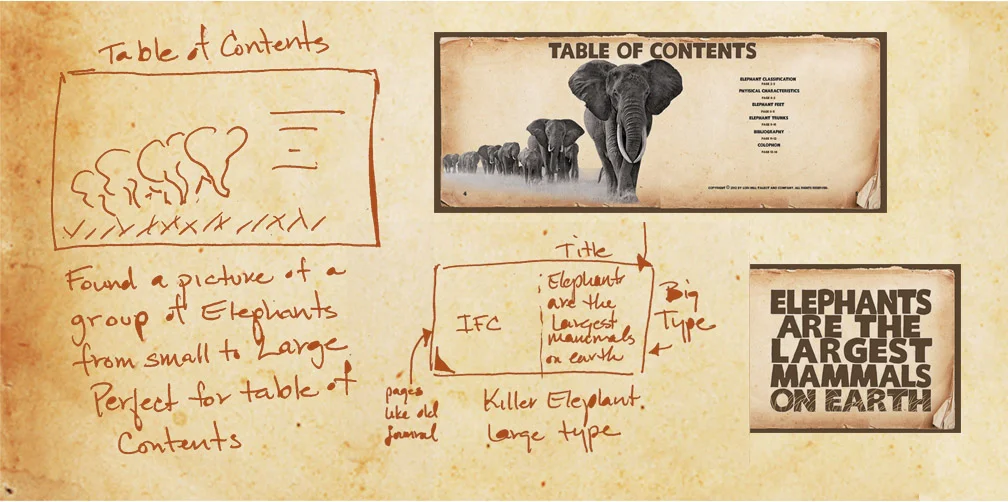
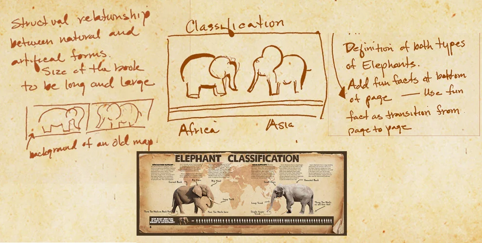
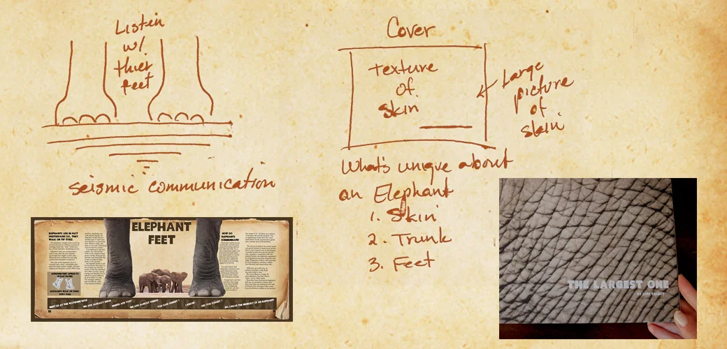
I chose for my natural, beauty in nature… the Elephant. It is the largest land animal on earth. My design throughout this book is based upon their size, and as a result everything in the book is large and over sized. The type is over sized, the margins are over sized and even the page numbers are oversized. An Elephant’s body is horizontality longer then its vertical height, and so the size of the book is horizontally longer then the height of the book. Overall the grid is a 6x6 grid because its larger columns and rows makes my layouts less complicated and larger. Like the Elephant!
Click here for a larger view
Three different fonts were chosen for the book. The title font is large and bold like the Elephant. The name of the font is “Killer Elephant.” The font is used in the book for my main title and subtitle type. The body type I chose is a font called “Folio", which has a similar structure of an Elephant. It is a clean simple san serf typeface. The body of the font is big and wide like an Elephant. I think it works well with “Killer Elephant” and is a good match. The other font I used was a handwritten style font called “Regular Joe”. I used it to create that big adventure, old handwritten journal feel to the book.
Color I feel is very important aspect in the book. The Elephant for it’s lack of beauty can be visually very attractive when surrounded with the right colors. Elephants are two colors: brown (African) and gray (Asian). So when choosing colors I choose colors similar to them. I used mostly different values of brown to create a rustic, natural, earthly tone throughout the book. Each spread has an image of grunge pages, which is found in the master page so that appears on all the pages. Again, I used these pages to create an old journal style book.
Click here for a larger view
In the layout of my designs I applied the Gestalt theory, which is how the mind organizes visual data to each of my pages. Using proximity, similarity, figure and ground and symmetry my goal was to create visual stimulating book.
LOGO DESIGN
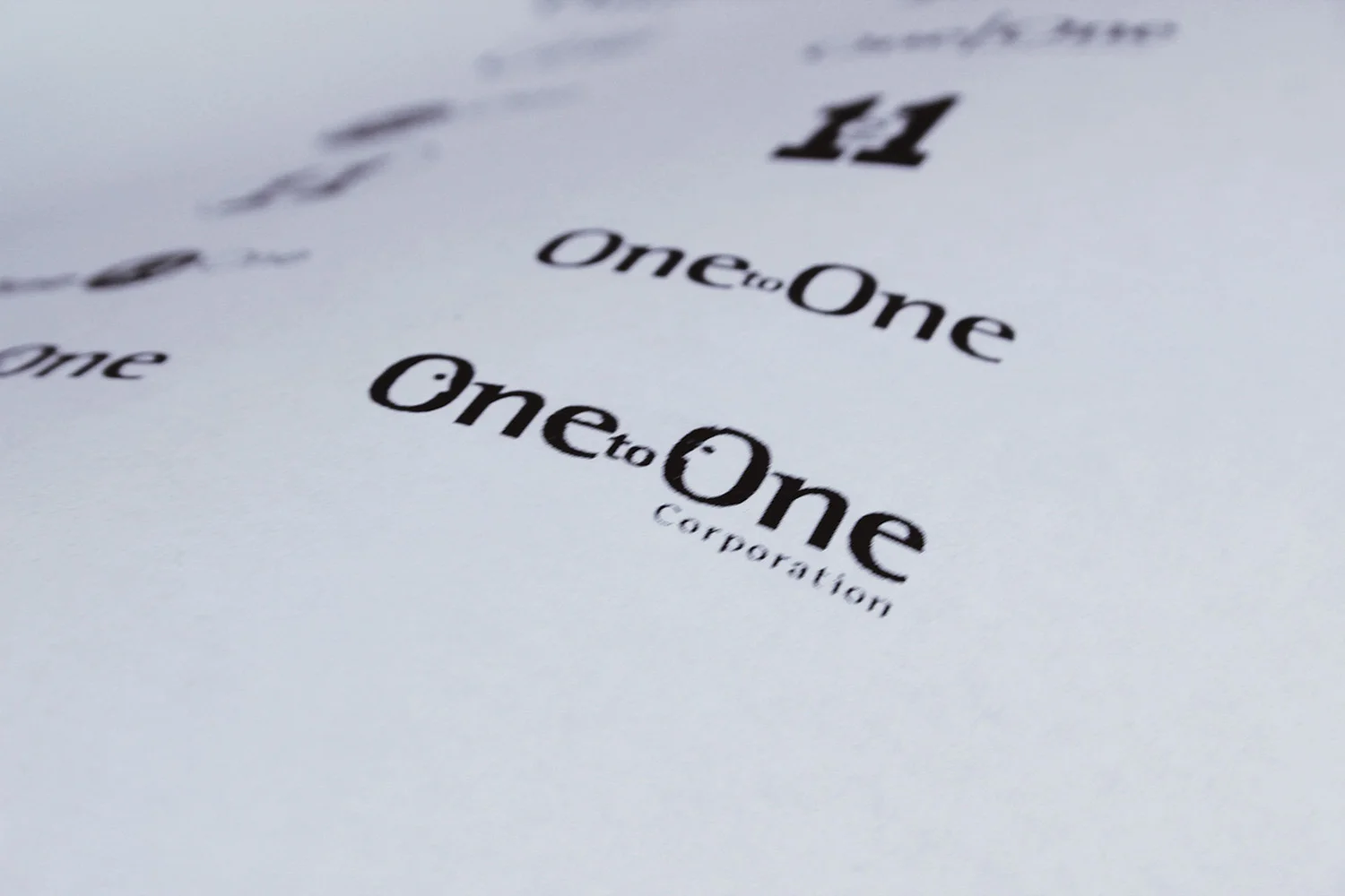
This brand identity was for an online consulting company called One to One. They provided corporate management the ability to conduct 1:1 online meetings with customers. Their target market was large consulting corporations in the high tech industry. They wanted to present themselves as being reliabe, experienced and knowlegeable. In the next two pages are the different rounds we went through before a final image was created.
First Round: After the first round of ideas I presented to my client they liked what they saw and asked for more abstraction in the logo design, along with using the url name 1:1 Corporation instead of the alphabetic name.
Second Round: An additional decision maker was brought in, who liked what I did in the first round, and wanted me to use some of those ideas moving forward. Overall they wanted the image to be more abstract with motion to show characteristics of union, differences and blending.
Third Round: They really liked the bottom two ideas. These ideas have the characteristics they were looking for, but wanted more motion of coming together.
Round Four: They liked the circles. Circles because they showed strength, and reliability. What I presented to you in this process is only about 25% of the total ideas/sketches I designed for this client. What I learned from this experience, get good direction before you put pencil to paper..


